AI AR Agent
AI AR Agent
Designed and refined the dashboard and workflows for a live AI assistant
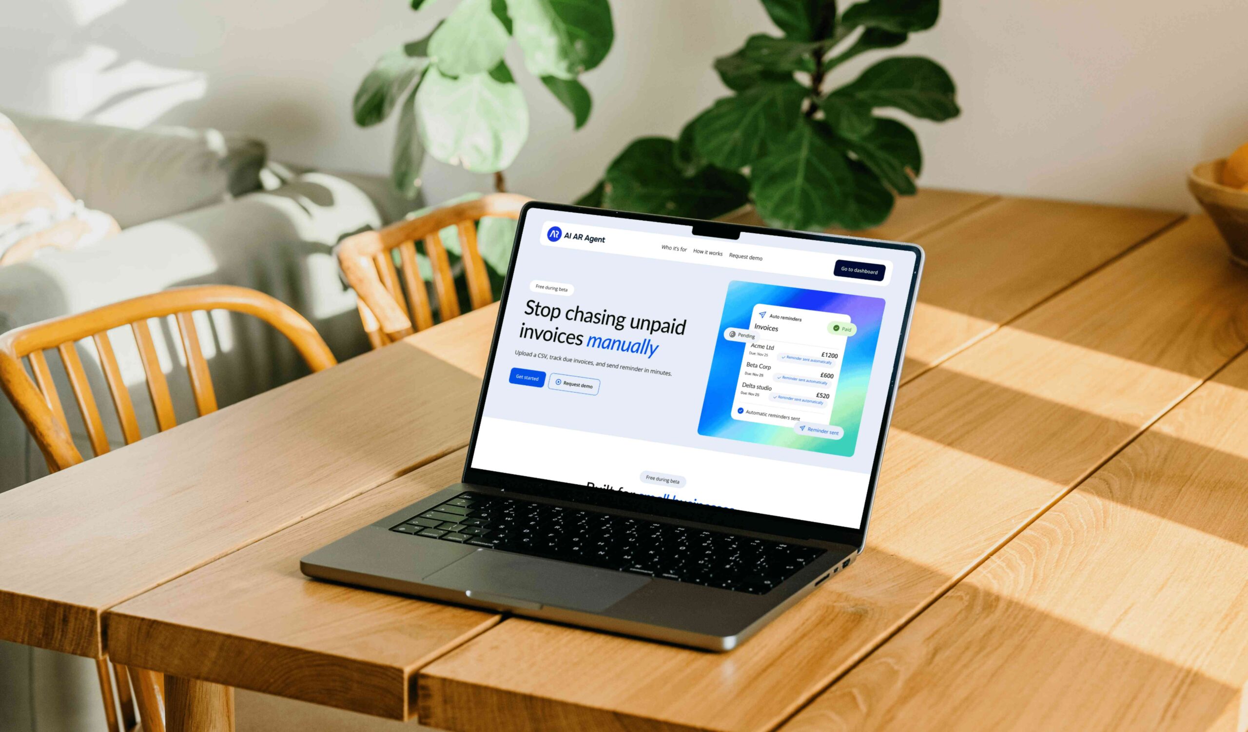
Redesigning a working but unstyled product into something small teams actually want to use. From zero visual identity to a full design system, step-by-step onboarding, and a responsive dashboard — designed solo, shipped on a real product.
OVERVIEW
AI AR Agent is a live SaaS product for freelancers, small businesses, and service teams. Upload a CSV of invoices — the agent tracks due dates and sends automated reminder emails to overdue clients. No accounting software required.
The product launched with working logic but no design foundation. My role was to take a developer-built interface and transform it into a product with clear user journeys, consistent visual language, and accessibility baked in — while collaborating directly with the developer throughout.
Deliverables
Design system, Prototypes, Responsive UI
Platform
Web — Desktop & Mobile
Tools
Figma, Claude AI
My role
UX/UI Designer
The problem
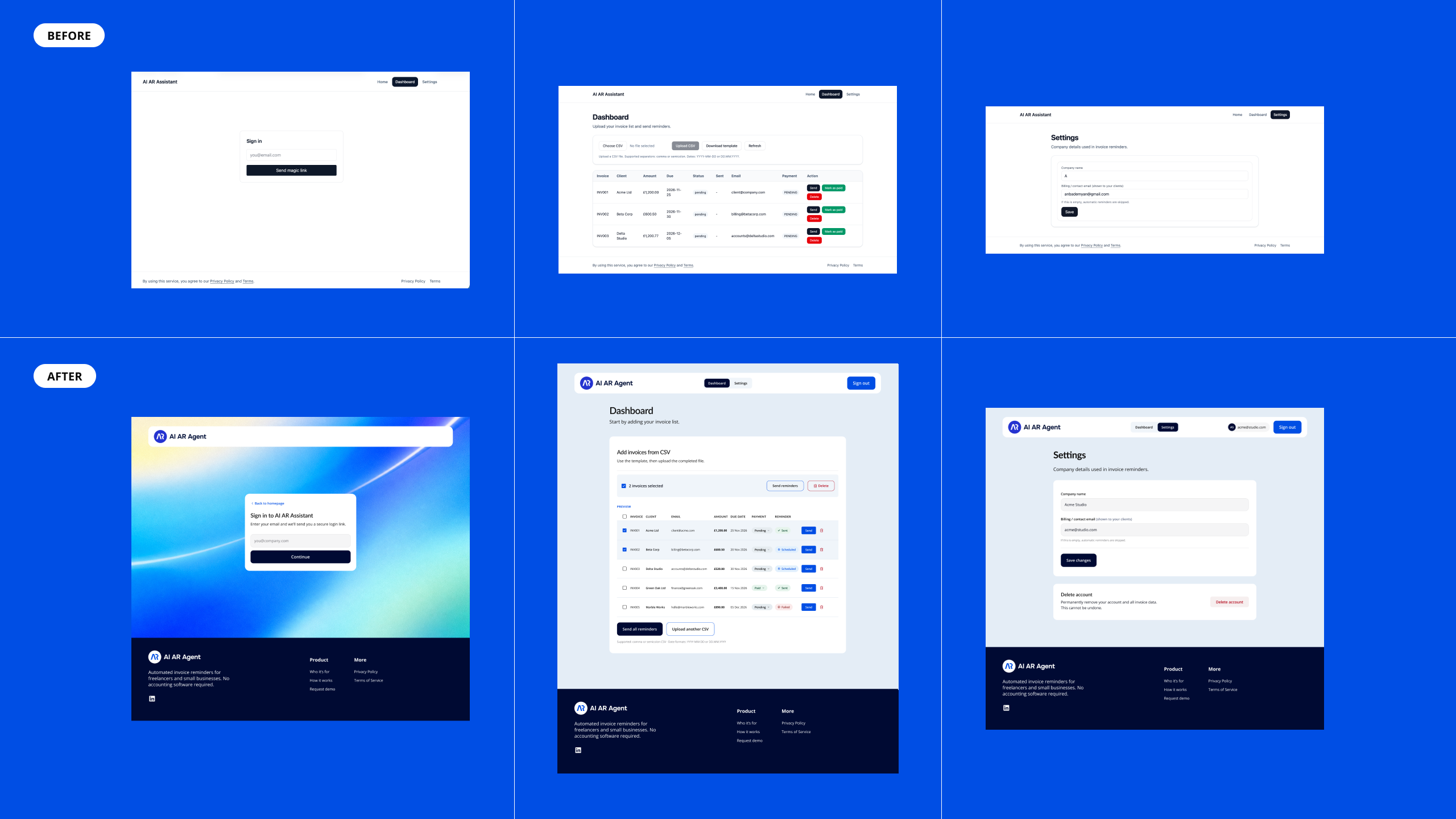
The original UI had no onboarding, four competing action buttons with no visual hierarchy, inconsistent status labels, and nothing to guide a new user through their first upload.
The solution
A structured onboarding flow, unified design system, dashboard redesigned around invoice status clarity, accessibility-considered UI (contrast, focus states, error messaging), and a mobile-responsive layout.
USER FLOW
Before designing screens, I mapped the complete user journey to identify key decision points and edge cases — from first landing on the homepage to sending reminders and managing account settings.
The flow revealed three critical moments that shaped design decisions: the magic link confirmation state (what if the email doesn’t arrive?), the CSV upload error state (what if the file format is wrong?), and the delete account
confirmation (irreversible action needs friction).
Mapping this upfront meant every screen had a clear purpose within the journey — nothing was designed in isolation.

DASHBOARD REDESIGN
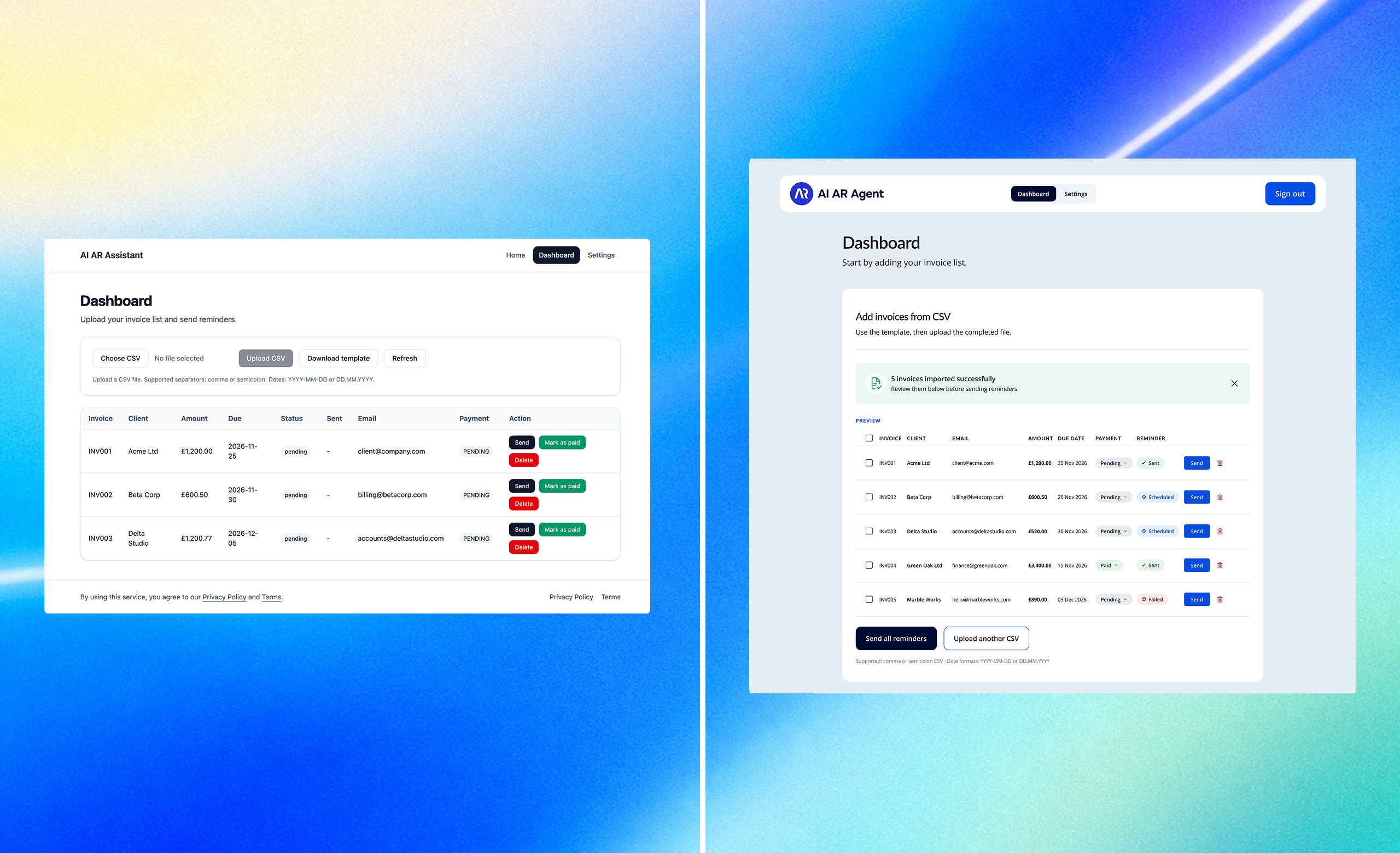
The dashboard is where users spend most of their time — so getting it right mattered. The original version worked, but it put too much on the user: four buttons competing for attention, no guidance for new users, and a table where every row had three action buttons stacked on top of each other. The redesign stripped that back and rebuilt it around a clearer question — what does this person need to do right now?
PRODUCT GOALS
Primary
Reduce time-to-first-reminder for new users by removing ambiguity from the upload flow
Secondary
Give returning users instant invoice status visibility without requiring any scanning or scrolling
UX
Establish a consistent interaction pattern for all invoice actions — single-row and bulk
Business
Make the product feel polished enough for beta users to share and recommend
WHAT WASN’T WORKING
- • No onboarding structure — new users landed on an empty table with no entry point
- • Four upload-related buttons with equal visual weight, no clear primary action
- • Three action buttons per row (Send, Mark as paid, Delete) — visually heavy and hard to scan
- • Status labels were plain text — “pending” looked identical to “paid”
- • No feedback after import — users had to figure out if the upload worked
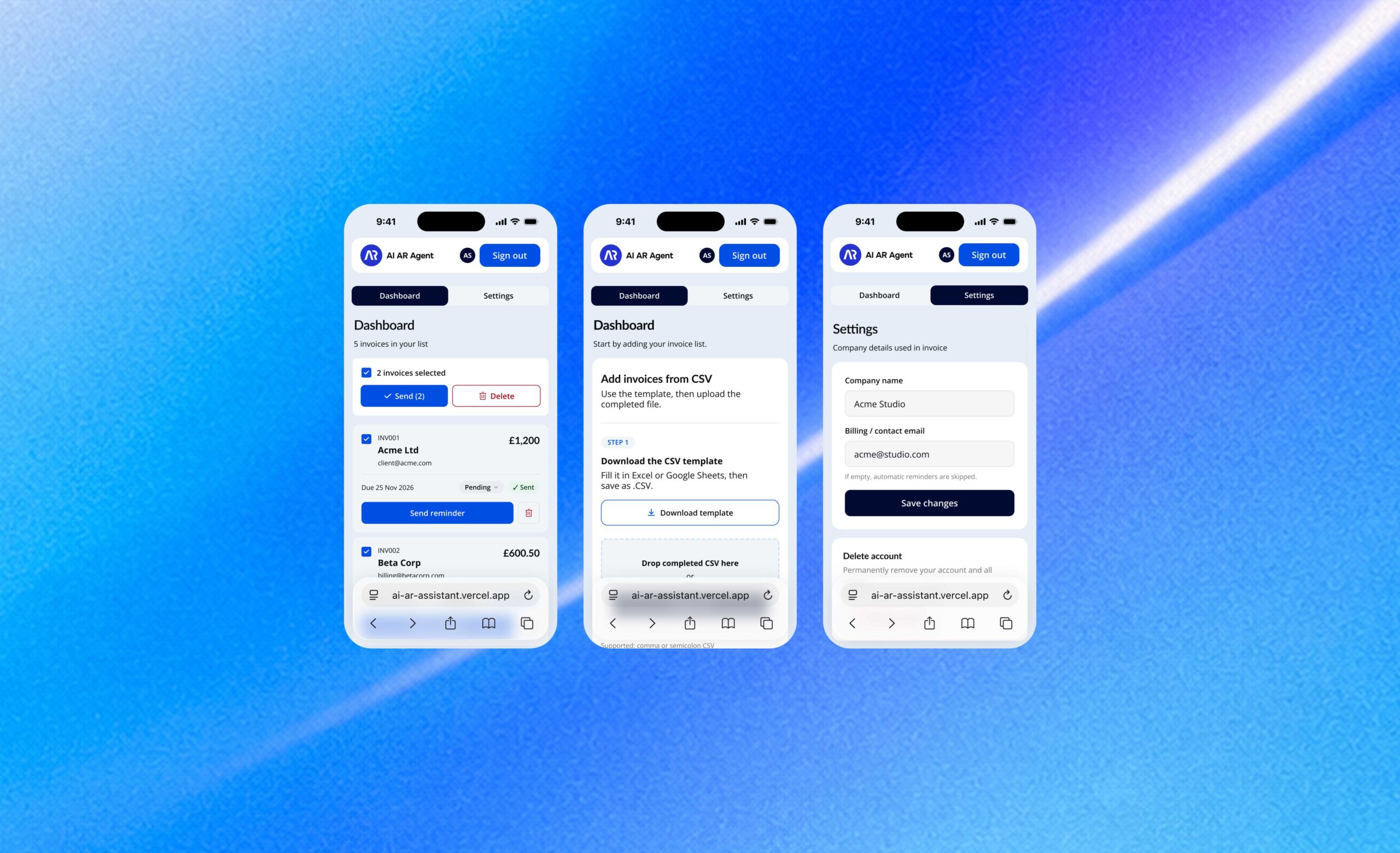
RESPONSIVE LAYOUT
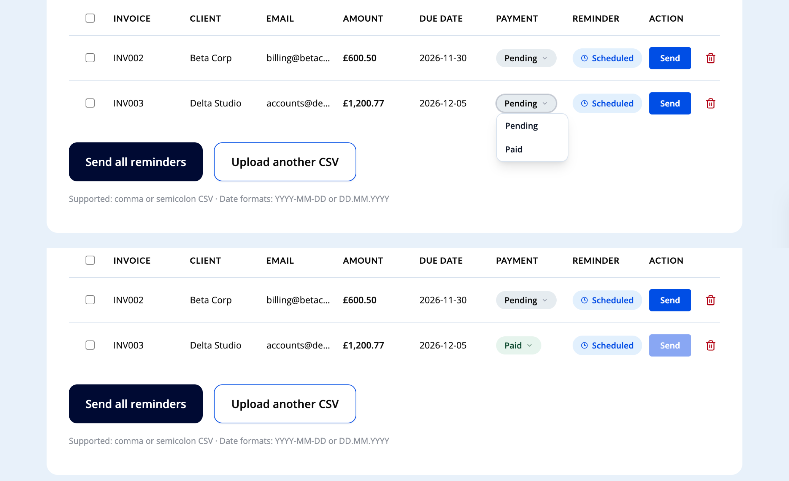
The same flow adapted for mobile — from empty state through CSV upload to a populated dashboard, plus account settings.
WHAT I CHANGED AND WHY
Guided upload — Step 1 / Step 2
Replaced the four competing buttons with a sequential two-step flow. First-time users always know where to start, and the structure makes the process feel manageable rather than technical.
Success banner
“5 invoices imported successfully” closes the upload loop and moves the user into action mode. It’s dismissable — returning users don’t see it again.
Bulk actions on selection
Send reminders and Delete only appear when rows are selected. This keeps the default view clean, and gives power users a faster path when managing multiple invoices at once.
Status badges — colour, text, icon
Each status communicates through three channels, not just colour. Sent, Scheduled, Failed, and Paid are instantly distinguishable — and the design holds up for colour-blind users too.
BEFORE VS AFTER
Before
- •No brand, plain white background
- •4 upload buttons, no clear hierarchy
- •3 action buttons stacked per row
- •Text-only status labels
- •No import confirmation
- •No bulk actions
After
- •Branded background, consistent visual language
- •Step 1 / Step 2 guided flow
- •Single Send button + inline status dropdown
- •Colour + icon + text badges (WCAG AA)
- •Success banner with dismiss
- •Checkbox bulk selection
USER IMPACT
The onboarding flow is designed to take new users from empty state to their first sent reminder without guesswork.
Status badges are designed to be scannable at a glance, replacing the duplicate action buttons that made the original table hard to read.
Status communication doesn’t rely on colour alone — I checked contrast and colour-blind accessibility, so the badges hold up for colour-blind users too.
The result is a dashboard designed to take new users from empty state to sending their first reminder without friction, and to let returning users see the state of all their invoices at a glance.
DESIGN SYSTEM
Colour Pallete
Chosen with B2B SaaS conventions in mind — trustworthy and professional without being generic. Navy #000A33 anchors the UI, carrying authority without the harshness of pure black. Blue #004EE4 is the single interactive colour — CTAs, links, active states — so there’s no ambiguity about what’s clickable. Success green #1D9E75 and destructive red #B10014 are reserved for genuinely positive or irreversible actions. Light blue backgrounds build visual hierarchy between page, cards, and surfaces without heavy borders.
Navy
#000A33
Blue primary
#004EE4
Light blue
#E4EDF6
Text
#212121
Secondary
#747479
Success
#1D9E75
Destructive
#B10014
Typography
Lato handles all headings — geometric and distinct without feeling corporate. Open Sans handles everything else — body copy, labels, dense dashboard data — staying neutral and readable at 12–16px.
The scale has separate desktop and mobile values, since content hierarchy shifts at smaller viewports — H1 drops from 72px to 38px to keep the same visual weight, while body sizes stay consistent since readability doesn’t need to change.
Stop chasing unpaid invoices
Lato Bold · 72px / 38px
Upload a CSV, track due invoices, and send reminder emails in minutes.
Open Sans · 16px

LOOKING BACK
This is a live product I’m still actively improving — right now, that means getting real users in front of it and collecting feedback on the decisions covered here: whether the onboarding flow genuinely removes guesswork, whether status badges read at a glance in practice. Working closely with the developer throughout shaped how I approached hand-off — designing with the existing logic and constraints in mind, not against them. It’s also where I’ve leaned most on AI tools day to day, from exploring UI directions quickly to speeding up how I document a design system like this one.