Credit Score App
From wireframes to a cross-platform Score experience — hi-fi UI, design system tokens, and micro-interactions.
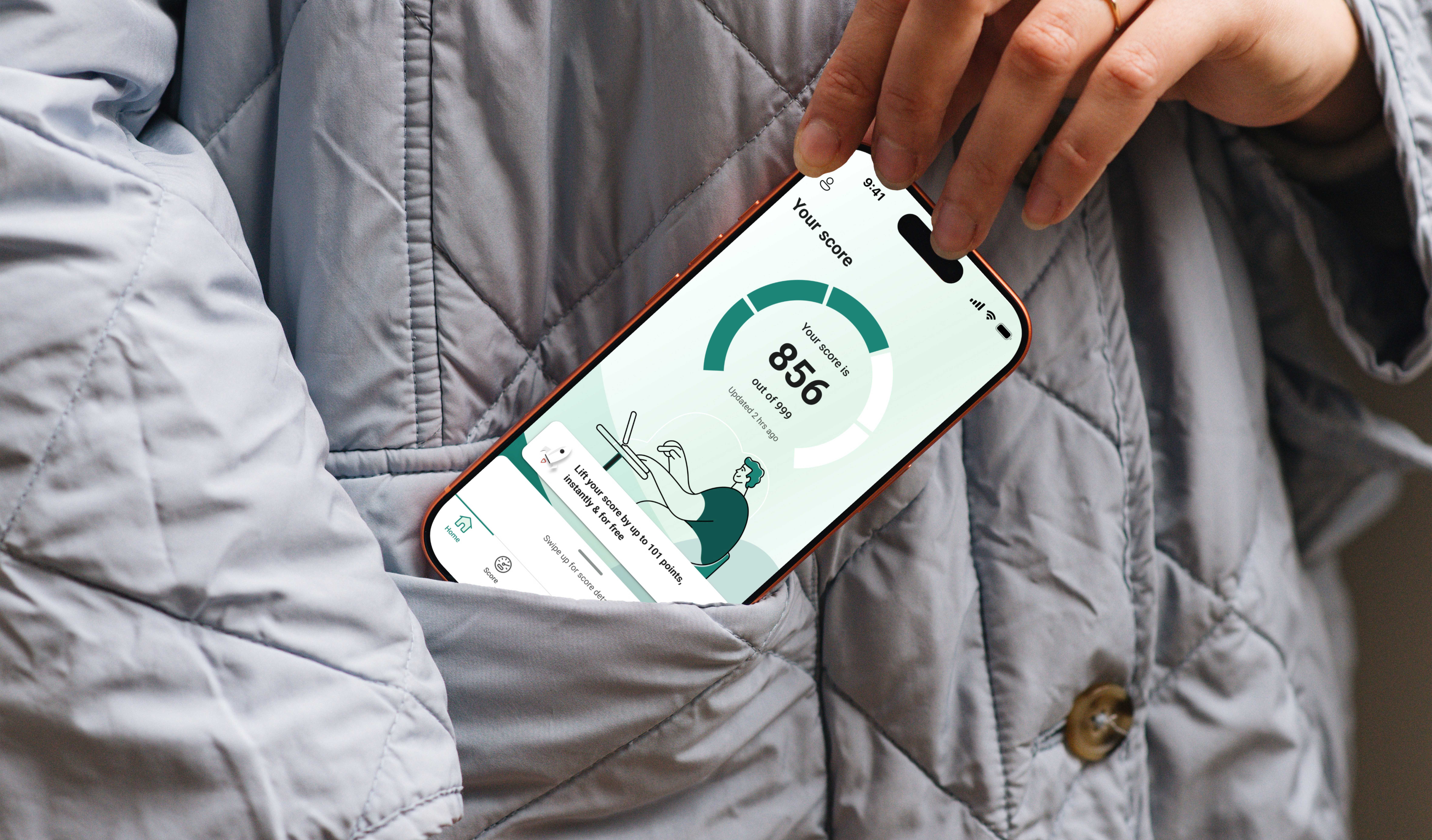
About this project
I worked on this project as part of a small design team at a digital agency, brought in to improve the UX and UI of an existing credit-monitoring product. I wasn’t involved in the initial product strategy or user research — my focus was translating wireframes into high-fidelity UI, extending the design system with new components and tokens, and designing the micro-interactions that tie the experience together.
This case study follows the Score journey: understanding your credit score, seeing what’s affecting it, and taking action to improve it — across iOS, Android, web and desktop.
Role
UI Designer
Tools
Figma
Industry
Fintech

Understanding your score
Starting from existing wireframes, I built the high-fidelity Score Analysis screen — a chart showing score history with a short-term forecast and a Score Simulator for modelling “what if” scenarios like taking out a loan.


Taking action, across platforms
The “Improve your score” flow needed to work consistently on iOS, Android, mobile web and desktop — each with its own platform conventions, from bottom tab bars on mobile to a persistent sidebar on desktop. I adapted the layout and interaction patterns for each platform while keeping the visual language and component library consistent throughout.

Design system contribution
Beyond individual screens, I extended the design system with the Impact Badge, Impact Trough and Impact Card components — a severity system (low / medium / high impact) used throughout the app to show, at a glance, how different financial factors affect the score. I also worked on the Credit Utilisation indicator — a simple progress bar shown at three levels of detail (icon-only, labelled, and inside an account card) — used to communicate how much of a credit limit someone is using at a glance. I defined the variants, states and design tokens behind these components, then reused them consistently across the Accounts, Current Account and Score screens shown here.
While pulling this case study together, I found an earlier dot-cluster concept for “impact severity” still sitting in the working file — the pill badge below is the version that shipped, and a stronger, more accessible pattern.
Impact severity — two approaches explored
I explored two ways to show impact severity. The pill badge (Concept B) is the one that shipped.
Concept A – dot cluster
Compact, but you need to read the dot pattern and a colour legend to understand it. Hard to scan quickly, and not accessible for screen readers.
Concept B – pill badge
Reads instantly with the text label, no legend needed — and works with screen readers. It also matches the badge styling used elsewhere in the Score flow.

Micro-interactions
I also worked on the animation layer — loading states, confirmations, and scanning feedback — choosing a pattern for each based on what it needed to communicate. For a longer background process like analysing bank data, a circular spinner signals “real work is happening” better than a dot loader, which reads as instant and can undersell how long the wait actually is. Toggling CreditLock on plays a lock-to-checkmark animation, giving immediate confirmation that protection is active. And Web Monitoring uses a subtle radar sweep to represent an ongoing, continuous scan — something a static icon can’t convey.

Looking back
This was a genuinely useful project to work on — I learned a lot about working within an existing product and design system, and about the habits that come with hand-off, documentation and staying consistent across platforms. Since then, I’ve started using AI more in my process. I’d now use it to help create design tokens faster and make the overall workflow a bit easier.