NEURO DIRECTORY
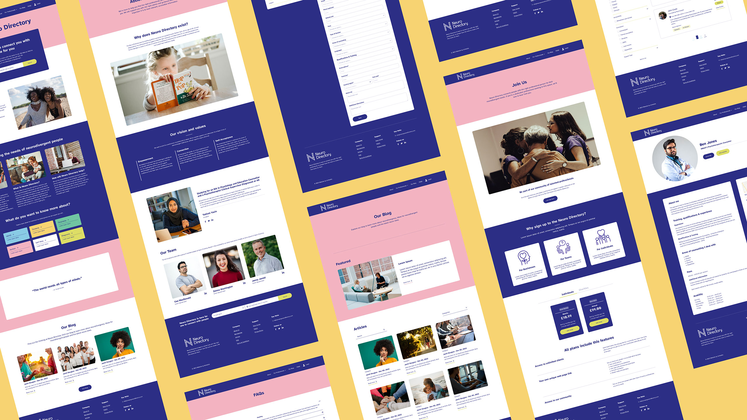
Creation of logo and website designs for Neuro Directory, helping neurodiverse people to get the support they need.
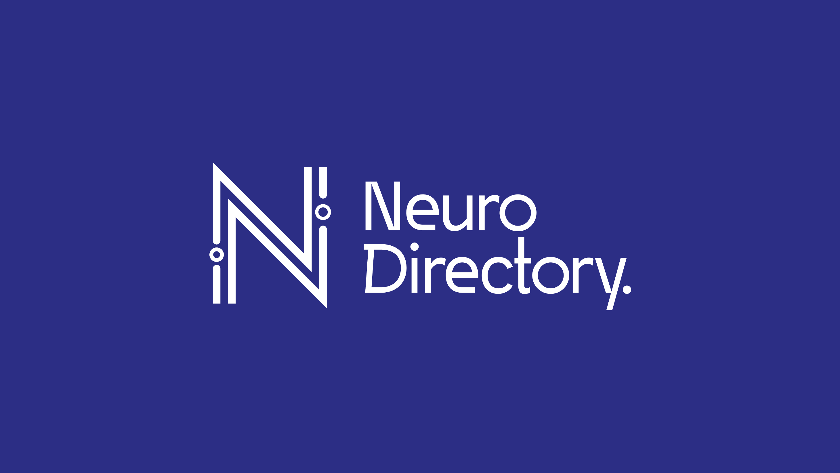
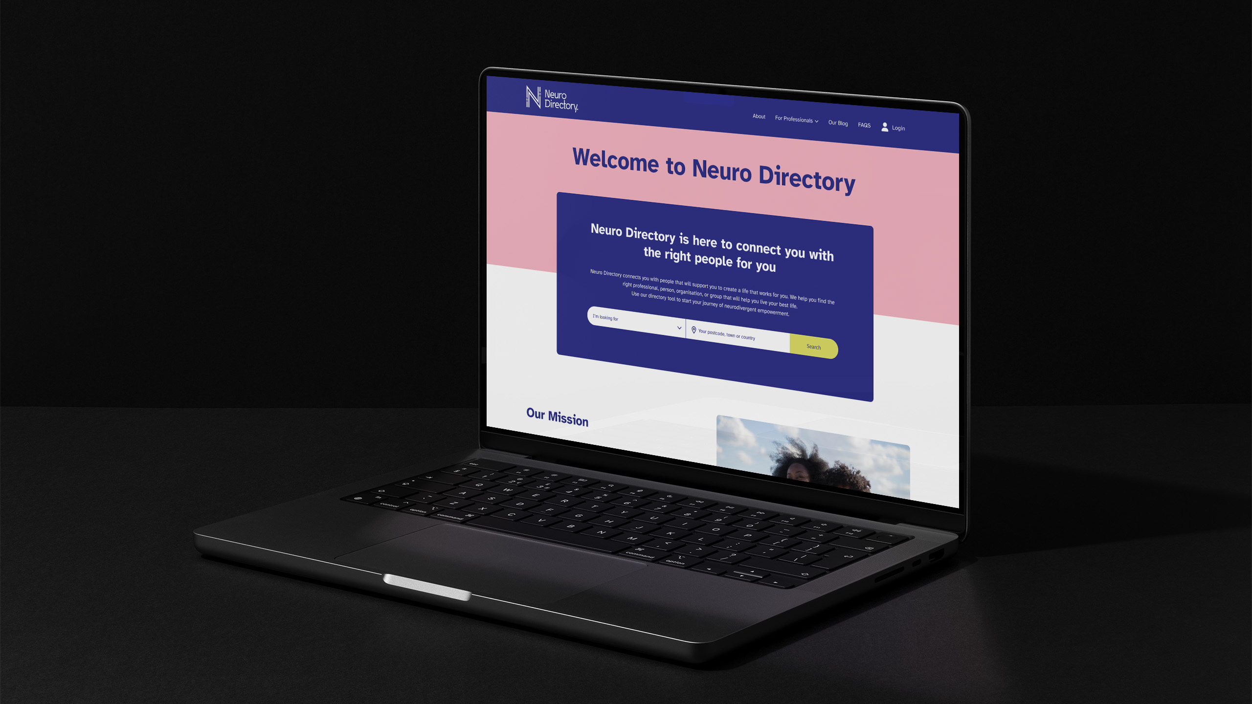
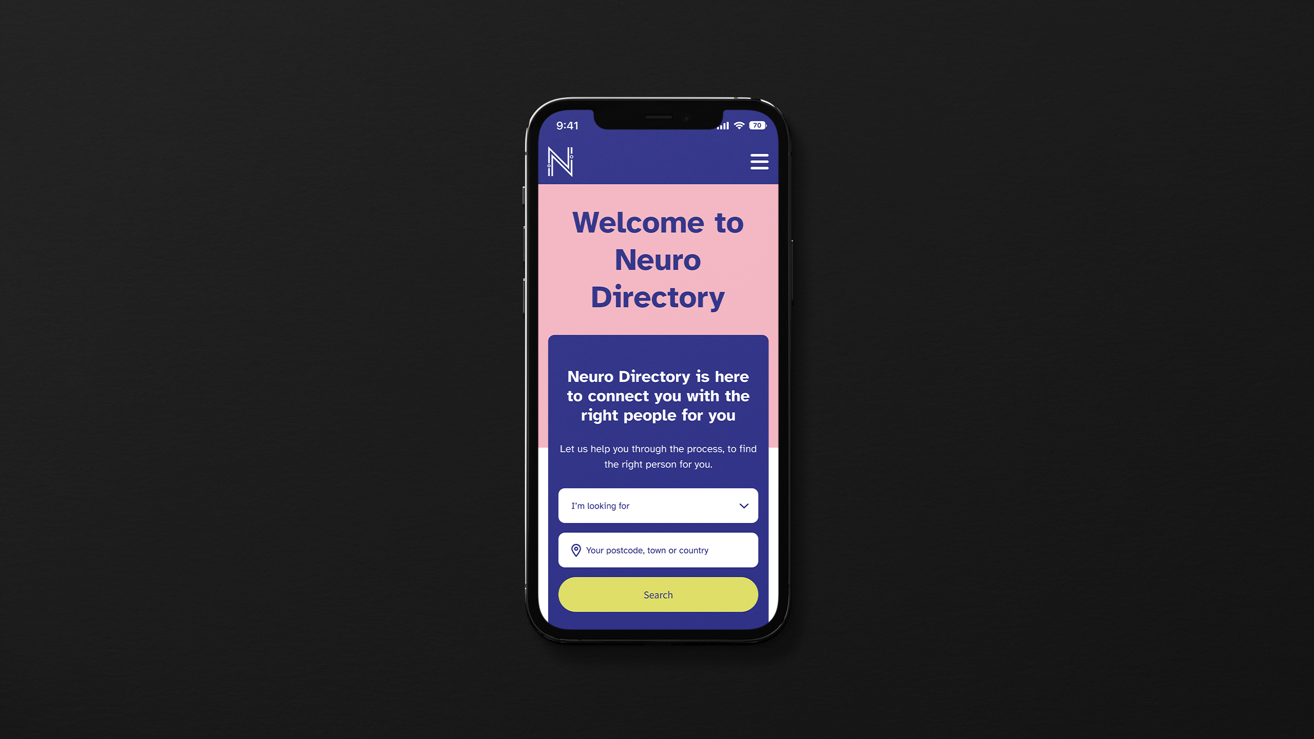
The website was designed to be dyslexia-friendly, with easy-to-read typography, simple navigation, and appropriate colour contrast. The logo will represent the organisation’s mission of supporting individuals with dyslexia.
In addition to these features, I tasked with creating a page that includes a database of professionals who can help people with neurodiversity. This page would allow visitors to search for professionals in their area and would also include information about each professional’s background, expertise, and contact information.
Furthermore, I was tasked with developing a registration and checkout system for professionals who want to make a registration on the website. This system would allow them to easily create an account, pay for any necessary fees, and provide all the necessary information required for the database.
Finally, I was tasked with making the website informative by providing users with valuable information about neurodiversity.
DELIVERABLES
Website design, UX/UI toolkit, palette & accessibility, digital guidance & navigation, logo design
SECTORS
Health services
LOCATION
Brighton, UK
To begin this project, I started with UX research and competitor analysis. This involved researching the needs and preferences of users with dyslexia and identifying any competing websites that offer similar services. Through this research, I gained a better understanding of the target audience and how to create a website that meets their needs and stands out from the competition.
After completing the research and analysis, I created a mood board. This involved gathering visual inspiration such as colours, fonts, and design elements that aligned with the project goals and target audience. The mood board served as a reference point and guide for the visual direction of the website.
With the mood board as a guide, I began to create initial designs for the website. This involved creating wireframes and mockups of the various pages and features of the website. The wireframes provided a rough outline of the website’s layout and functionality, while the mockups showed a more detailed visual design and aesthetic.
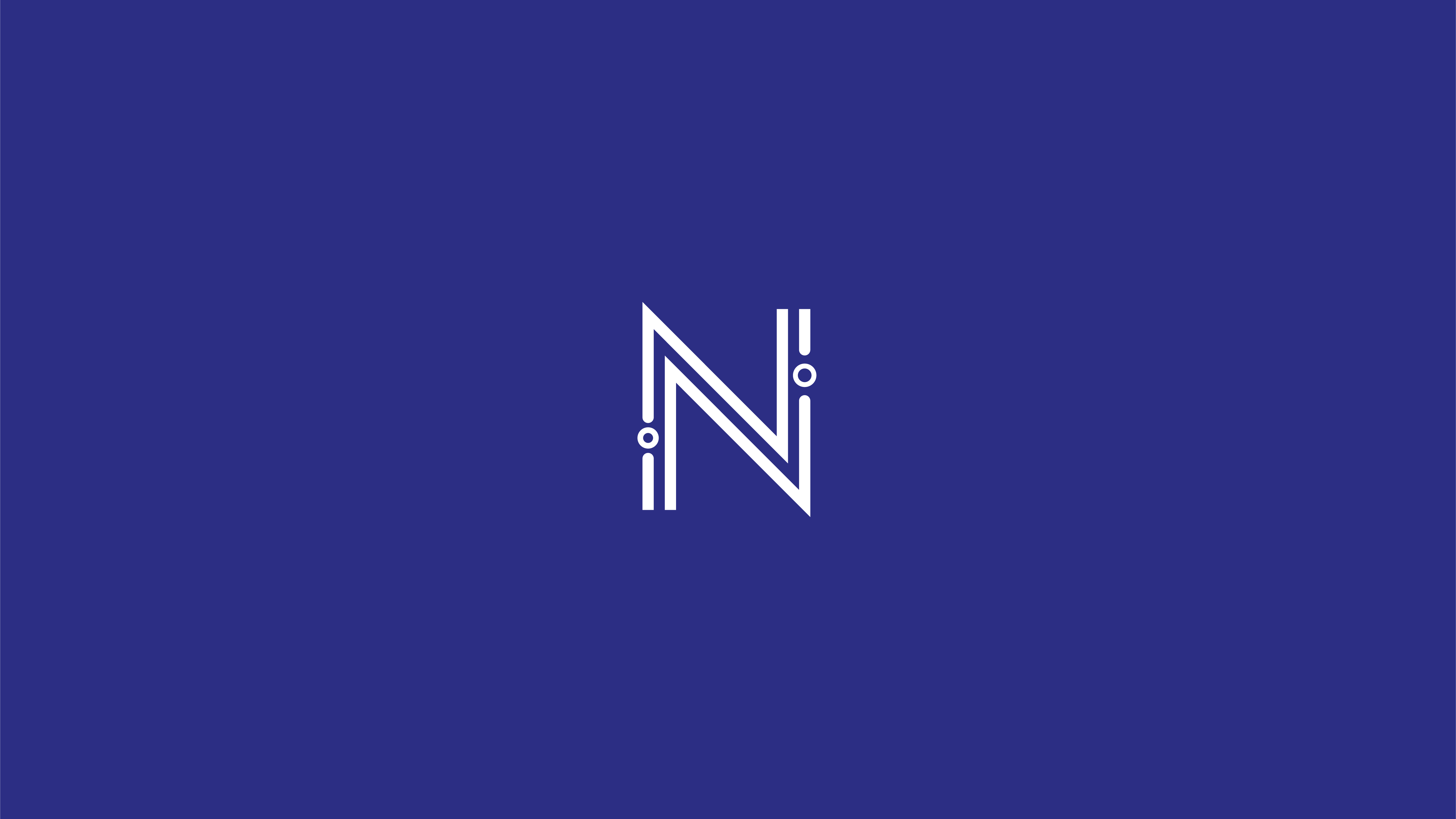
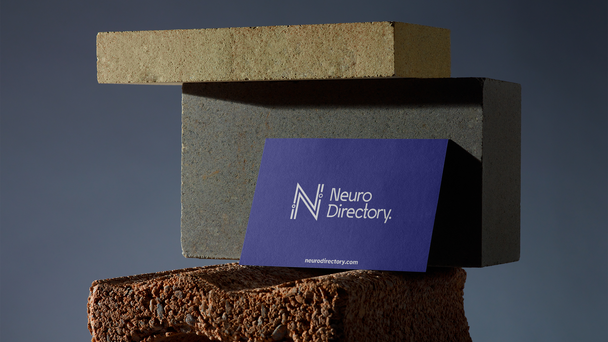
When I was tasked with creating a logo for the website, I started by thinking about the main goals of the website and what message I wanted to convey through the logo. I knew that the website was focused on helping people with dyslexia and providing them with access to professionals who can help. With that in mind, I wanted the logo to be reflective of those goals.
Next, I conducted research on competitors to see what type of logos they use and to ensure that the logo I created was unique and different from theirs. I wanted the logo to stand out and be easily recognisable, so I needed to make sure it was different from other websites that cater to people with dyslexia or related conditions.
One unique aspect I incorporated into the logo was the use of the dyslexia font. This font can make it easier for users to read and understand the content on the website, which was a priority given the website’s focus on accessibility.
Another key element of the logo is the letter N which is a central point of the logo. It designed with round elements which looks like neurones and represent a focus on the neurological aspects of dyslexia, also they add depth and texture to the logo and create a memorable and recognisable elements that are unique.
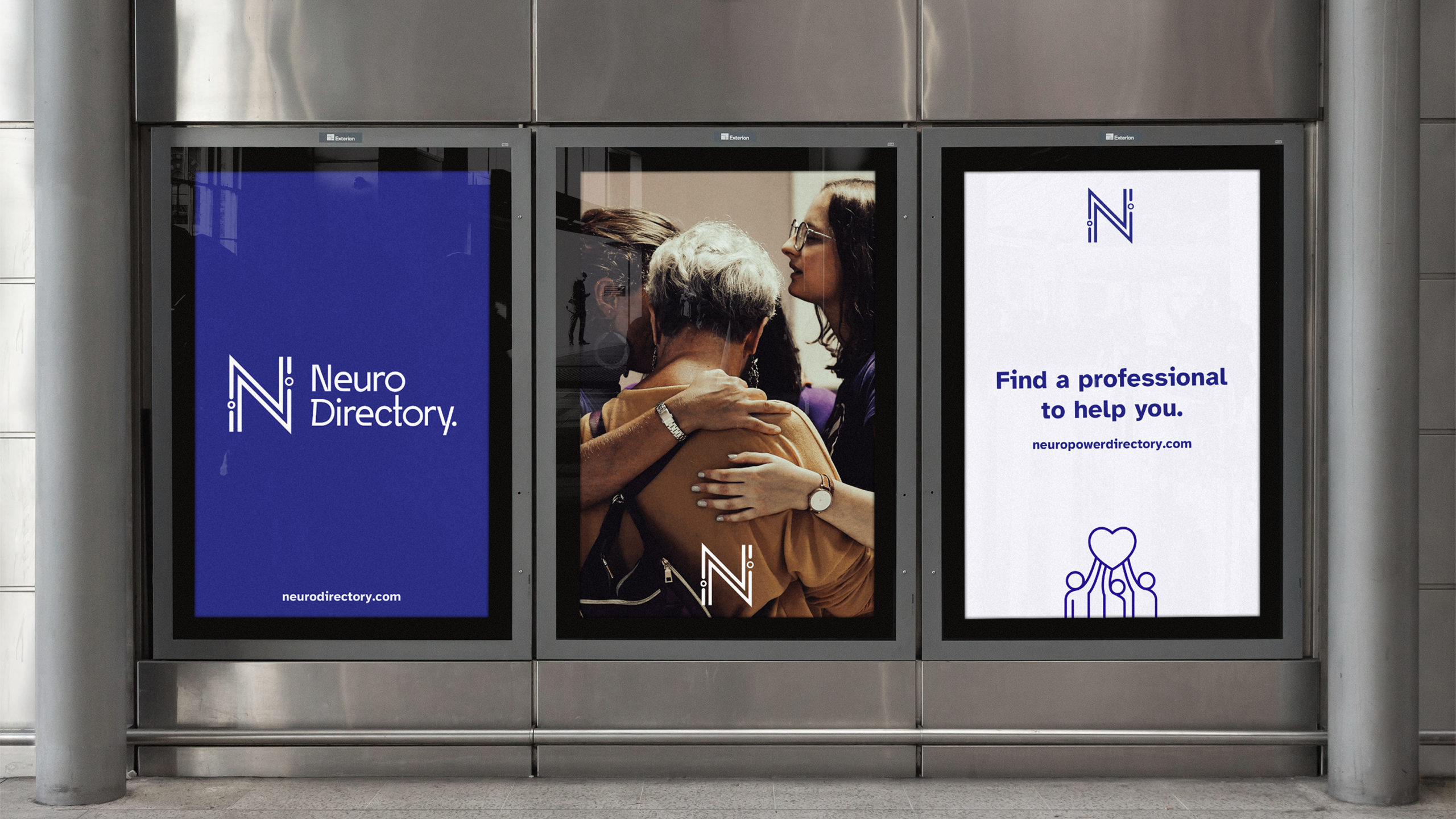
As the project progressed, I worked closely with the design and development team to ensure that the project was moving forward smoothly and meeting the project goals. Collaboration was key to the success of the project, and we held regular meetings to discuss progress, address any concerns or issues, and make adjustments to the project plan.
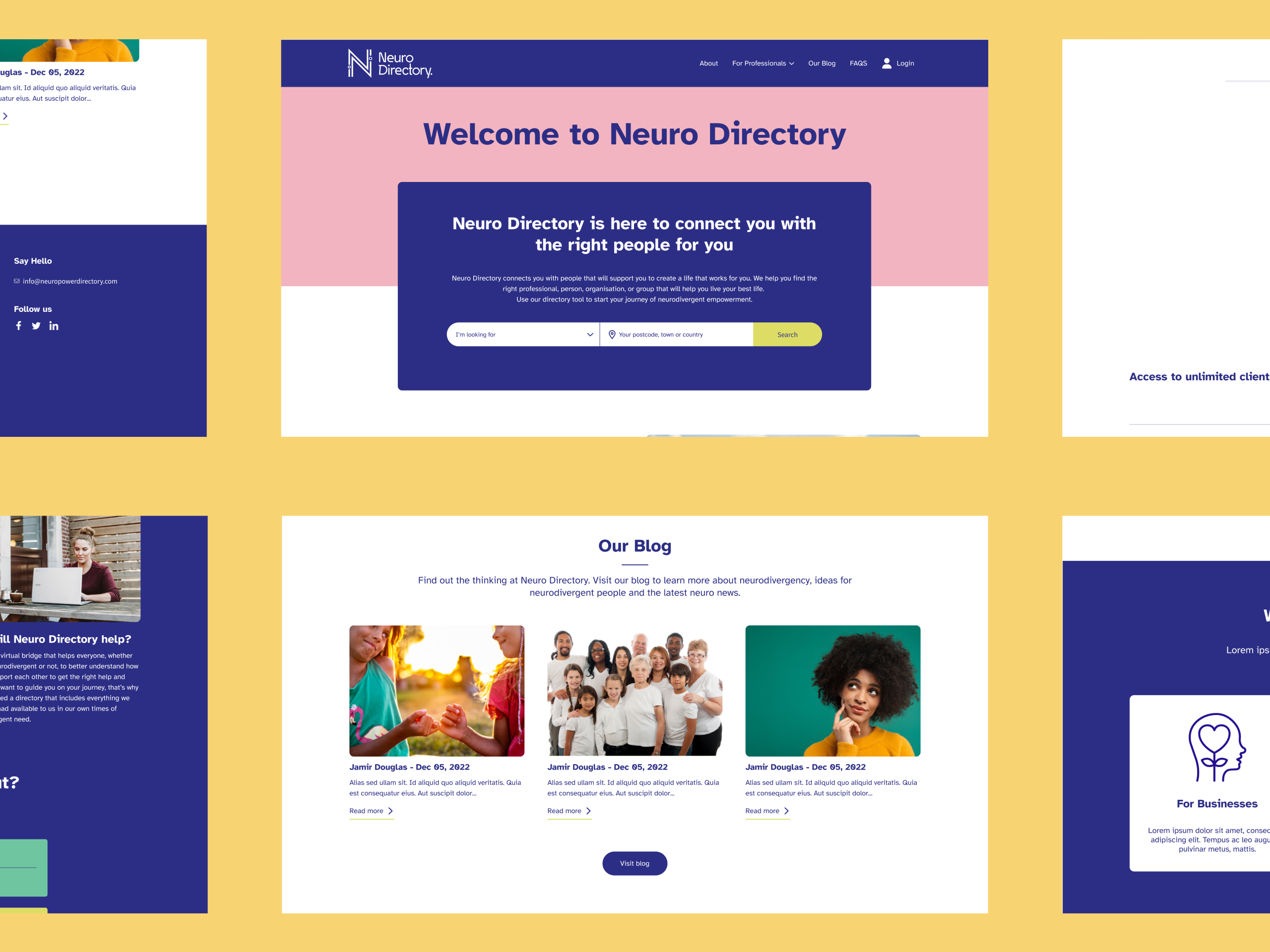
By creating a website that was user-focused and incorporated a dyslexia font, we were able to provide a more accessible experience for users with dyslexia.
The website design also included a simple navigation system and a directory of professionals who could help users. This provided a valuable resource for users and helped to establish the Neuro Directory as a trusted authority in the field.
The feedback we received from the client was very positive. She was impressed with the final logo design and felt that it captured the essence of the brand. The client also appreciated the collaborative approach we took throughout the design process and the fact that we were able to deliver a website that met their needs and exceeded their expectations.
This work was completed as part of an internship at UnitedUs